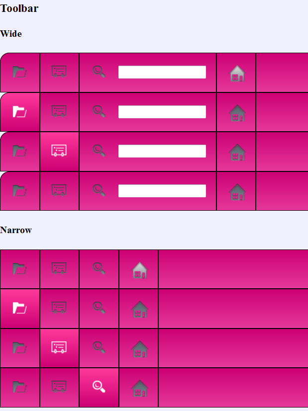
To round out the series of blogs for our reverb customizations, we are going to go back to the default Reverb style. This is the one that most of you are familiar with probably because it has been with us for the longest time, and kudos to anyone who has been customizaing with this since the beginning as well! We are going to focus this week on getting the icons fully customized. For the purposes of this demonstration, we are going to use Fireworks because that is what our customizable icon palette is based from. So, right now we are starting from the customized CSS of the toolbar. As you can see, I have made the gradients a little bit lighter as to contrast that the button is being moused over, but really there are no limits to the colors you can put on the gradients or type of gradients as discussed in my previous post
If you were to mouse over these icons in their non-customized state, they would appear a blue color. To fix this, we need to double-click the skin.Fireworks.png under Advanced -> Manage Format Customizations and in the File explorer under Pages -> Images. Now we open this file in Fireworks. Here is a screengrab of how my environment looks in Fireworks:
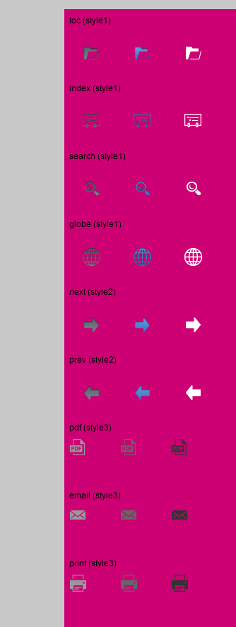
This background was set manually so that I would have a better idea of how these icons will look with modifications. In Fireworks, I set this by going to Modify -> Canvas -> Canvas Color and manually put in the CD0074 value after clicking the custom radio button. Alternatively, you can go to Properties and select the transparencies there. Remember if you set this, you will need to set it back to transparent when you are saving as the skin.png.
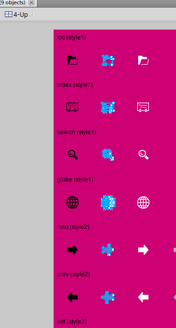
So, now we get to change our icons. We are focusing on the left-hand group as the right-hand group is meant for the compact styles. As a guide to which icons correspond to which behavior, the left-most group is the button unhovered. The middle (by default blue) are the buttons hovered, and the right group is the clicked or selected group. So, let’s get a little crazy and change the normal buttons to black, the hover buttons to neon green and make no changes to the selected group. While making the changes, you will notices that there is actually a 4th column to the right on the arrows. This is actually to indicate that there there is no more navigation back or forward. For this button, I decide to make it a faded pink to go along with my theme. I personally use the brightness/contrast, or the hue/saturation controls to adjust the colors and do a multiple select so that it gets applied to all the icons evenly:
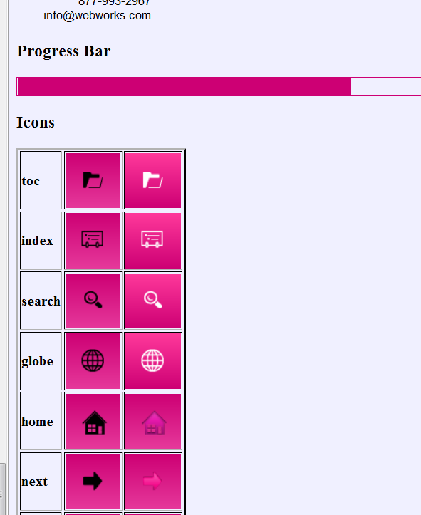
Now, you go back to the transparent background, and then save as the skin.png (which will overwrite your default, so say OK when it asks you to) and then you you can refresh the Skin.html window and your newly changed icons will be visible:
There are a few more customizations I could do in this project, but I hope you get a good idea through CSS and the image modification of what I can do. For further reading on how we used one image to create the background for the whole menubar and TOC, you can refer to CSS and sprites here, here and here. Files are uploaded to the Wiki Page so you can test with this yourself (all files are in the 2013.1 version)
Valuable information! Looking forward to seeing your notes posted. Thank you for sharing the nice article. Good to see your article. https://apps2apk.in/fastpokemap/
I would like to change the color of the reverb top banner, above the toolbar, as well as the body in which topics are displayed, which both seem to have a white default; can you advise please?